Sunday, 24 July 2011

Pictures from planes

Every time I travel by plane, I want to take pictures of the landscape passing gently but quickly underneath. I have only very occasionally managed to get anything useful out of my attempts, though. It's a tough environment, after all: Constant shaking, limited viewport, thick crappy slabs of transparent plastic, lots of UV light, extra haze, and typically bright light. Our eyes adjust, but the camera struggles.

Here's an example of a picture that works out, though more in an abstract manner than a direct depiction. It took some drastic manipulation to make it useful, so I'll go a bit more into details:


The first version is how it came out of the camera; had I been the type to delete on the camera, it would have gone.
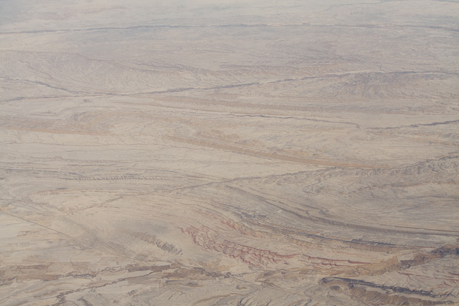

The second one is with auto white balance and auto toning. Not much better, but you can start to see things.


The third and final one is with manual adjustments up the wazoo. For the Lightroom users: Exposure -1.2, Blacks +100, Brightness +58, Contrast +100, Clarity +77, Vibrance +45, Strong contrast tone curve with Highlights +49, Lights -11, Darks -100, Shadows -15, and finally a graduated filter over most of it with Brightness -21, Contrast 13, Saturation -8, Clarity 51.

This is a massive adjustment that would normally ruin a photo, but for these pictures, it's the only way to save them. And it's only because it's shot in raw that there is so much to save. To determine which of the shots I'd taken were any good, I applied the more extreme of these settings to all the shots, and got surprisingly many I liked.

Fleeting light

Photography has rightfully been called "painting with light". In most cases, the light plays the role of oils on a canvas, but sometimes it comes center stage (to mix a metaphor) and really make everything else the frame. Those instances, alas, are few and fleeting, partly because of the differences between how the eyes and the camera sees the world.

"Bush at Sunset" ©2010 Lars Clausen
Buy this photo at Redbubble.com

I remember when taking this picture outside Odense, Denmark that I felt like I'd missed the good sunset and was just taking photos because, well, I had little else to do out there. Only when I came back and saw it on the screen did I realize how the light had played out beautifully. I guess if I went out much more often and looked at the pictures immediately after, I would eventually get to recognize what light actually makes for good pictures.

Friday, 1 July 2011

Rocket of flowers

Flowers are so obvious a photographic target that they are difficult to make interesting photos of. These flowers stood at the corner of a building, with the sun just barely peeking around the corner. I had to twist into a very specific position to ensure I got the translucency without having the sun itself hitting the lens and destroying the contrast. It turned out nicely.

Thursday, 30 June 2011

Unintentional blurring

Blurring is probably the main new idea that photography brought to the art world. Both blurring to show motion (in several ways) and blurring to show depth of field are very common photographic techniques, and all photographers should know how to use them effectively.

What's less common is taking a completely static scene and intentionally moving the camera while shooting. I've seen a couple of attempts at making intentionally blurred images this way, with some amount of success by Alain Briot, less so with most others. Mostly, I find it pretensious, a sort of anti-art breaking the rules just for the sake of breaking the rules, and I have shied away from doing it intentionally. However, I can't avoid getting shaken pictures with some frequency (especially when using a long lens), and ever so occasionally one of them gets a special expression of its own that's actually better than what a sharp picture of the same scene would have been. Here are two that I particularly like.


The first one is from Garmisch-Partenkirchen, taken while driving past some scattered houses in a bus. Between the clouds, the dirt on the window, and the shake, this image has a desolate quality and a dreaminess, as of half-forgotten places on the outskirts on reality. It works mainly because the blur is parallel with the houses, where it's most obvious, and isn't really noticable on the forest.


The second one is from Englischer Garten, and in this case my shake is very random and even across the photo, though with areas where it is not noticable. It gives an impressionistic style that removes the image from the mundane and adds some mystery, a sense of ages past and idyllic French villages.

Which is of course a total lie, but that's photography for you.

Sunday, 26 June 2011

Telling a story

One of the main things art can do is tell a story. Traditionally, this has not been the forte of photography, being more the domain of songs, books, motion pictures and comics. But when a photo manages to do more than portray a place, a thing or a person, it gains power and interest.

I don't normally try for the story-telling approach, finding it easier to bring interest through shape, composition and color, but when I find a story told through one of my pictures, I find that it is elevated to something more than its plain technical and compositional contents. It comes alive, and becomes funny or sad or encouraging or puzzling.

When I took this picture, I just looked at the pattern of the ski tracks. Only at home did I notice the one track leaving the rest and ending badly. That, in all its simplicity, is a story.

Tree trunks

Like many photographers before me, I gravitate towards the strange shapes and textures found in tree trunks everywhere. From the straight and stately beech to the knotted, twisted old oak tree to the jumble of intertwined branches found in bushes, they fascinate me. Especially when shown out of context to stand on their own, they are familiar items displayed in unfamiliar ways, drawing attention to parts you normally pass by. Here are two examples from opposite sides of the Puddle, worlds apart in tree style, shape and artistic treatment, yet drawing on the same love of the twisted and knotty yet sturdy wonders of nature.


Saturday, 25 June 2011

Carry a *really* long lens

This photo may seem mundane, but the fun thing about it is that it's taken with a silly, silly setup: The EF-S 60mm macro lens plus an 8x CrystalVue teleextender. The thing to note isn't the incredible quality, but the fact that it's of quality at all. There's quite a bit of blue/red fringing around the camera, but the hand actually has quite a bit of detail. I borrowed it from my brother, who kept getting bad vignetting with it on the compact camera in the picture. Not sure why I didn't get any, but we're swapping this for the smaller 8x CrystalVue teleextender I had lying around.

Yes, I know it's really small aperture, cheap glass, etc etc, but it's fun to play around with, and I definitely want to try it out on my 55-250, which it would turn into a 440-2000 (!) mm lens. Dunno if it'll work, but it'll be fun to find out. I'm a fan of the idea of front-mounted tele extenders. They allow for having a larger entry pupil, so they don't necessarily cut the aperture as badly as a rear-mounted one. Unfortunately, they are mostly made for compacts and video cameras, so generally not of the best quality and with small rear pupils. I was amazed that there was no vignetting to speak of in this case.

The image is so small because I'm using a limited version of the LR/Blog plugin